oil on gessobord, 6" x 6"
This is the last color variation for this image. For these color studies, I have tried to push the color a lot from what one would consider "normal" colors for a landscape.
Below are two photos of the beginning of this painting:
I first toned the canvas with a medium value blue (this isn't the best photo - the blue was more of a turquoise or teal), then blocked in the shapes with a brown. Next I added the grayed light blue to the ground area, trying to keep it really loose.
Then I added another blue hue to the sky area and added exaggerated intense color to the trees. I started out loose, hoping I would stay loose, but as you can see in the final painting, it got a bit tighter than I was hoping for...and the colors changed to more muted neutrals and "softer" which I actually like a lot.
Other stuff:
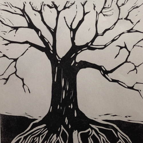
Below is my first try at relief printmaking. There are things about this print that I like but also some mistakes. We just finished our third week, and I am finding I really love the process.
If you are interested in the relief printmaking process, go to this website. It has lots of good information.
Have a great week!


No comments:
Post a Comment